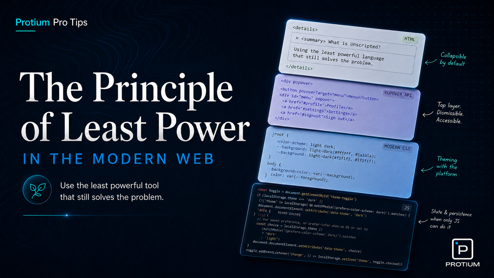
The Principle of Least Power was first defined in Tim Berners-Lee’s Axioms of Web Architecture back in 1998. In a nutshell, it puts forth the argument that the least powerful language should be used for a task that gets the job done. With powerful languages come more freedom, but that freedom brings along some tradeoffs: greater complexity, larger execution costs, and more room for unintended behavior. Declarative languages like HTML and CSS are constrained by design, which makes them easier for browsers, tools, and developers to reason about. That may all sound a bit abstract, so let me give you a tiny history lesson, and then show some examples of how to leverage this principle in the year of our lord 2026.
In 1995 JavaScript (and myself) arrived on this world. The possibilities that came with this new arrival were astronomical (referring to JavaScript now - my arrival has been somewhat less impactful). Over the past three decades, it has grown to dominate the modern web. Over time though, outside of the spotlight, HTML and CSS have been growing in capability, and now much of what used to require JS to work can be done without it.
I know, I know - talk is cheap, show me the code. Fine - here are some prime candidates for replacing imperative JS behavior with declarative HTML and CSS or as I like to say: unscripting.
The Collapsible Panel
Any frontend developer has at some point had to implement a expandable/ collapsible panel. They probably wrote some code that looked something like this:
the code
<!-- A clickable control the user sees. "id" is a unique name so the script can find this button later. -->
<button id="trigger">expand/ collapse</button>
<!-- The paragraph that will show or hide. It starts with no special "visible" styling. -->
<p id="content" class="">
  Bits of moving fluff laws of physics with pretty stories for which there's
  little good evidence of brilliant syntheses two ghostly white figures in
  coveralls and helmets are softly dancing light years.
</p>
<style>
  /* By default: treat the paragraph as completely hidden (not shown on screen, not laid out). */
  #content {
    display: none;
  }
  /* When the "visible" class is added to the paragraph's class list, show it as normal block text. */
  #content.visible {
    display: block;
  }
</style>
<script>
  // Grab the button and the paragraph from the page using the ids we gave them above.
  var trigger = document.getElementById("trigger");
  var content = document.getElementById("content");

  // When someone clicks the button, run our small function below.
  trigger.addEventListener("click", handleAccordion);

  function handleAccordion() {
    // Flip "visible" class on or off: if it was hidden, show it; if it was shown, hide it.
    content.classList.toggle("visible");
  }
</script>
Quite a bit of code to perform this action. We needed CSS and JS to help us get there. Then in 2013 the W3C introduced a working draft for the <details> and <summary> elements. It took nearly a decade for it to be widely available across all major browsers, but by golly it was worth the wait. The entirety of the code above can now be replaced with this:
the code
<!-- Built-in "disclosure" widget: the browser handles open/close for you—no script required. -->
<details>
  <!-- This line is always visible and acts as the clickable heading / toggle. -->
  <summary>expand/ collapse</summary>
  <!-- Everything after summary is the body: shown when open, hidden when closed. -->
  Bits of moving fluff laws of physics with pretty stories for which there's
  little good evidence of brilliant syntheses two ghostly white figures in
  coveralls and helmets are softly dancing light years.
</details>
Voila! Isn’t that a treat. Besides the absolute win of having to write far less code, you also get keyboard support, accessible state exposure, and screen reader semantics for free. All things you’d have to wire up manually in the JS version.
We’re not done with collapsible panels yet though. Next we’ll look at transitioning the height smoothly. This is simple enough when you know what the expanded height should be, as CSS can handle transitioning from one static height to another. But very often that’s not the case. We might not know how much content will be in the panel, or what viewport the user is on which would affect how tall the panel should be. There are two older methods to deal with this, neither of which are ideal:
- The first requires setting a
max-height to 0 on the collapsed content, and then a large enough magic number for the max height in the expanded state to cover the content - like max-height: 9999px. This does work, but we’re here for magic, not magic numbers.
- The second requires JS to calculate the height of the panel before it could be expanded. That would look something like this:
the code
<!-- Button and text panel again; this time we animate height instead of toggling display on/off. -->
<button id="trigger">expand/ collapse</button>
<p id="content">
  Bits of moving fluff laws of physics with pretty stories for which there's
  little good evidence of brilliant syntheses two ghostly white figures in
  coveralls and helmets are softly dancing light years.
</p>
<style>
  /* Start collapsed: zero height, but keep the text in the document—just clipped out of view. */
  #content {
    height: 0;
    overflow: hidden;
    /* When height changes, animate smoothly over 0.3 seconds instead of jumping. */
    transition: height 0.3s ease;
  }
</style>
<script>
  // Same pattern as before: find the button and the paragraph by their ids.
  var trigger = document.getElementById("trigger");
  var content = document.getElementById("content");
  // Simple flag: are we currently in the "expanded" state?
  var isOpen = false;

  trigger.addEventListener("click", handleAccordion);

  // After a height animation finishes, if we're open, let height become "automatic"
  // so if the text reflows or grows, the box can grow with it (CSS can't animate to "auto" directly).
  content.addEventListener("transitionend", function () {
    if (isOpen) {
      // once expanded, switch to auto so the panel can grow with its content
      content.style.height = "auto";
    }
  });

  function handleAccordion() {
    if (isOpen) {
      // Closing: pin height to the real pixel height first, then animate down to zero.
      // going from auto back to a pixel value, then to 0, with a forced reflow in between
      content.style.height = content.scrollHeight + "px";
      content.offsetHeight; // force reflow
      content.style.height = "0";
      isOpen = false;
    } else {
      // Opening: animate from current height up to however tall the content actually is.
      content.style.height = content.scrollHeight + "px";
      isOpen = true;
    }
  }
</script>
Quite the dance, just to animate to auto. Fortunately for us though, there is a CSS trick one can use to achieve the same behavior without any JS. Shout out to Nelson Menezes who originally came up with this technique. Here’s how it goes:
the code
<!-- Same native open/close as before; the extra wrappers exist only so we can animate smoothly. -->
<details>
  <summary>expand/ collapse</summary>
  <!-- Outer shell: its grid row will grow from "nothing" to "full size" for the animation. -->
  <div class="expandable-content">
    <!-- Inner box: holds the text and clips anything that spills while the outer row is still small. -->
    <div class="expandable-content-inner">
      Bits of moving fluff laws of physics with pretty stories for which there's
      little good evidence of brilliant syntheses two ghostly white figures in
      coveralls and helmets are softly dancing light years.
    </div>
  </div>
</details>
<style>
  details::details-content {
    /* disable the content-visibility property as we're taking the visibility of the content into our own hands now */
    content-visibility: visible;
  }
  /* When the details panel is open, give the outer wrapper a "full" row (1 fraction of available space). */
  details[open] .expandable-content {
    grid-template-rows: 1fr;
  }
  .expandable-content {
    /* CSS Grid lets us animate a row from effectively zero height up to the content's natural height. */
    display: grid;
    /* Collapsed: the row is 0 fractional units—tight shut. */
    grid-template-rows: 0fr;
    /* Smoothly change that row size over 0.3s (browsers can interpolate fr values). */
    transition: 0.3s grid-template-rows;
  }
  .expandable-content-inner {
    /* Hide overflow while collapsing so text doesn't peek out mid-animation. */
    overflow: clip;
    /* Allow the grid child to shrink below its content size so 0fr can actually collapse it. */
    min-height: 0;
  }
</style>
You can’t transition height to auto1 - but you CAN transition grid-template-rows from 0fr to 1fr.
The Popover
If you’ve ever had the pleasure of building a tooltip, dropdown, or ‘floating’ UI element of any sort, you’ll know that the JS tax is steep. You’ve got to handle visibility, controlling z-index so it renders above the surrounding content, detecting clicks outside the element to dismiss it, and managing aria attributes so that screen readers know what’s actually going on. That might look something like this:
the code
<button id="trigger">Show info</button>
<!-- The popover panel. Starts hidden via CSS -->
<div id="popover" role="tooltip" aria-hidden="true">
  This is some extra information that only appears on demand.
</div>
<style>
  #popover {
    display: none;
    position: fixed;
    top: 50px;
    left: 0;
    z-index: 9999;
    background: white;
    border: 1px solid;
    padding: 1rem;
  }

  #popover.visible {
    display: block;
  }
</style>

<script>
  var trigger = document.getElementById("trigger");
  var popover = document.getElementById("popover");

  trigger.addEventListener("click", function (e) {
    e.stopPropagation(); // prevent the document click handler from immediately closing it
    var isOpen = popover.classList.toggle("visible");
    // Keep aria in sync with the actual state.
    trigger.setAttribute("aria-expanded", isOpen);
    popover.setAttribute("aria-hidden", !isOpen);
  });

  // Clicking anywhere outside the popover closes it.
  document.addEventListener("click", function (e) {
    if (!popover.contains(e.target)) {
      popover.classList.remove("visible");
      trigger.setAttribute("aria-expanded", "false");
      popover.setAttribute("aria-hidden", "true");
    }
  });
</script>
Even this stripped-down version has a lot of logic to manage, and that’s without even considering focus trapping, escape key handling, or the famed z-index arms race many developers have come to know. Enter the Popover API.
the code
<!-- Wire the button to the popover by matching popovertarget to the panel's id. That's it. -->
<button popovertarget="my-popover">Show info</button>
<!-- The popover="auto" attribute does all the heavy lifting. -->
<div id="my-popover" popover="auto">
  This is some extra information that only appears on demand.
</div>
Three attributes, no script. The browser now takes care of toggle behaviour, click-outside dismissal, escape key handling, and accessibility for FREE. It also solves the stacking issue in a fundamentally better way: by displaying the popover in a completely different layer to the rest of the page. The browsers top layer sits above everything else on the page, so it will always render above other content.
The Theme Switch
There are almost as many ways to handle dark/light mode as there are JS frameworks. A common version starts with JavaScript stamping a data-theme attribute onto the document, then saving the result to localStorage. In React, that often grows into a ThemeProvider, a context, a hook, and state that exists mostly to flip a class. Useful, sure, but it is a lot of application logic for something CSS is increasingly capable of handling itself.
Before we reach for an event listener, let’s start with the version that needs no toggle at all. If the goal is to respect the user’s system preference, CSS already has the pieces: color-scheme tells the browser the page supports both themes, and light-dark() lets our tokens respond to whichever scheme is active.
the code
:root {
  color-scheme: light dark;
  --background: light-dark(#ffffff, #1a1a1a);
  --foreground: light-dark(#1a1a1a, #ffffff);
}

body {
  background-color: var(--background);
  color: var(--foreground);
}
That’s already useful, but users often want to choose a theme for themselves. This is where :has() gets interesting: CSS can read the state of a checkbox and use it to style the document, even when the checkbox and the styled elements are in completely different parts of the DOM.
the code
<label for="theme-toggle">
  <input type="checkbox" id="theme-toggle" />
  Toggle theme
</label>
<style>
  :root:has(#theme-toggle:checked) {
    color-scheme: dark;
  }
</style>
Checked means dark: the :has() selector reads that state, flips color-scheme, and every light-dark() value on the page responds instantly. No event listeners, no setAttribute, no framework. The only thing missing is memory: once the page reloads, that checkbox goes back to its default state.
Keeping track of a user’s choice across sessions is exactly the kind of stateful, imperative work JavaScript is built for. Here it genuinely earns its place:
the code
const toggle = document.getElementById("theme-toggle");

// On load: restore saved override if there is one
const saved = localStorage.getItem("theme-override");
if (saved !== null) {
  toggle.checked = saved === "true";
} else {
  // No saved preference — mirror whatever the OS is set to
  toggle.checked = window.matchMedia("(prefers-color-scheme: dark)").matches;
}

// On change: save the new state
toggle.addEventListener("change", () =>
  localStorage.setItem("theme-override", toggle.checked),
);
CSS handles the visuals, the browser handles the system preference, and JS handles the thing that actually needs it: remembering a choice.
Conclusion
The goal here is not to remove all JS from your project. The goal is to stop reaching for the most powerful tool first. When HTML or CSS can carry the behavior, let them. If they can’t, check whether the web platform already gives you the behavior natively. You ship more semantic markup, less JavaScript, and fewer little piles of state for your team to manage. Users get pages that load faster and behave more predictably; developers get interfaces with fewer moving parts.
That’s the Principle of Least Power in practice: use the least powerful language that gets the job done, and let the browser do the job it was built to do.